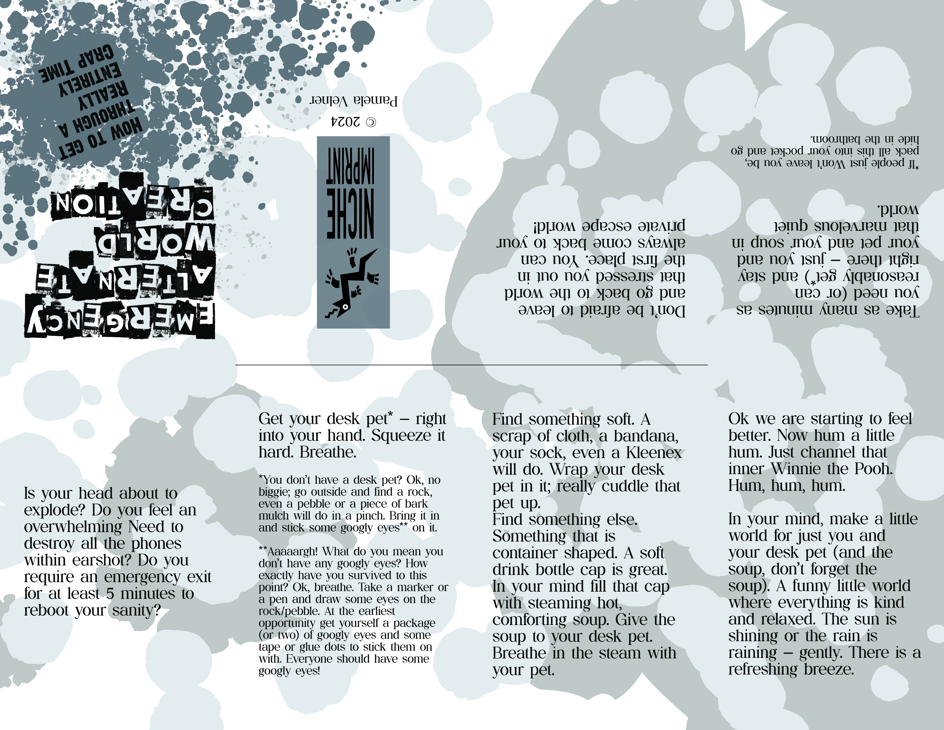
So I decided to try and do some art to work it out. So I brain dumped on a page. Just dumped out everything that I thought might make me feel just a smidge better.
Then I made it into a zine. Which I have decided to share with you here.
It’s a one sheet 8 page mini zine. The inside (poster) side of the sheet shows my personal desk pets enjoying a lovely cup of bottle cap soup! Side note: The books they are leaning against hold up my monitor to a nice and proper viewing height.
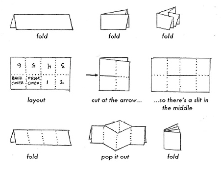
Here is a diagram of how to fold and cut it. OK, so I looked up the diagram after I made the zine. I took a scrap of paper and folded up a mock up and numbered it. My page numbers are a bit mirrored from the how-to diagram. My sheet is 1-8-7-6 (upside down) and 2-3-4-5 (right side up). It still works fundamentally like the diagram, just make sure you fold the cover to the very outside.
I hope this helps destress and/or cheer you. I know I feel just the tiniest bit better now.
I’m reading this wonderful, non-fiction book for beginning writers. I mean really, really wonderful. It is going to help so many people who rather desperately need that help in writing their novels.
However.
Yah, you knew that was coming.
No, I’m am not going to talk about using “Wedding Invitation” fonts or any of the other horrible errors in judgement that some people make that cause their book scream “I have NO IDEA what I am Doing!”
This is not at all that sort of issue. This book is a very nearly PERFECT book.
BUT there is an issue, a big knee-capping issue. It is in the compositing of the pages.
Fact: I used to be a professional proofreader, back in the days when publishers and book manufacturers had composition departments. Every publisher, university, technical book company had what was called “style” standards or even a “signature style”. As in; you could pick up an academic book in a book store and know immediately if it was published by University of California. Just by the font choice and page style.
There are/were books published that delineated these styles. I still have a copy of The Chicago Manual of Style on my own personal bookshelf.
So back to the book. I’m steaming along, loving the way it is written. The voice . . . I’m just loving the voice. It’s like I’m having a conversation with a friend over coffee. A lovely, brutally honest friend who is telling the reality of how to do what I’m thinking about trying to do.
And I hit it. A headline all by itself at the bottom of a page. Its related content all alone at the top of the next page, screaming like an abandoned baby in a stroller that is plummeting down a flight of steps.
I think, this is a mistake – this somehow just got overlooked. She is too good a writer for this to have happened. She would never let that baby text go screaming to its doom in rush hour traffic.
And then it happened again . . . and again, and again. Now I’m screaming inside my head – HOW?
Suddenly it hits me. This is one of those “everyone knows” errors.
This is Victorian three piece salt and pepper service. Salt, Pepper and what?. No One Knows! These things were so ubiquitous that Everyone Knew what the little bowl was for (mustard, relish?), so matter of fact that NO ONE ever wrote down what that third piece was meant to hold!
So now we still have a bunch of these things floating around the houses of those who love antiques but no one knows what is the proper thing to put in the little bowl.
So Why Don’t Any of the Style Books Say “No Headlines at the End of a Page?”
Because Everyone Knew. Everyone knew that leaving a headline or even subhead alone at the end of a page was such a heinously unacceptable thing that no one would allow it.
Back in the day plenty of the contracts/style pages that came in with books would say things like “no widows, no orphans” or “no orphans”. A widow is the first line of a paragraph left alone at the end of a page; even if it was only preceded by another text paragraph. An orphan was the last line of a paragraph falling as the first line of a new page.
I don’t think a contract ever said: “A headline or subhead near the bottom of a page must be followed by at least two lines of text”. Because it was understood that this was the way things were done.
We all knew that to do otherwise was to totally and absolutely disrupt the flow of the writing. Like hitting a tall brick wall painted with Radioactive Zombies Ahead signs: Halt All Progress. Not to mention leaving all the baby text falling down that next page hill with no one to save it.
I can live with widows. Orphans still make me cringe but publishers are increasing finding them acceptable. But there isn’t even a term for leaving a headline alone at the bottom of the page. I guess we should make one up. Maybe we should call it the “no radioactive zombies” clause of your books style.
So if you are self publishing please keep your book free of this Roadblock error. If you’ve hired a book compositor and they are young-ish; please pass this information along.
Over the holiday break I’ve been watching Station Eleven on HBO Max.
It has hit me hard. Very hard.
Like others from the geographical location of the show watching the events of the show has I grew up in Michigan, I spent my summers on the west (Lake Michigan) coast. I still live in Michigan and still spend my holidays in the Grand Traverse area. Hell, we have a 20-plus year relationship with the same small lakeside-eleven-room-resort where we stay every time. Watching the show play out in places I know like the back of my hand has been to put it mildly, impactful.
It has made me realize that I am still carrying A Lot of unresolved trauma. Trauma that I had thought that I had dealt with and laid down decades ago. Trauma that has come back to haunt me in the not so distant past.
Trauma that has kept me wary. Trauma that has led to most of my friends being unaware of my past, or even the extent of my current isolation.
Watching episode nine yesterday left me in a state of quiet peace. I am trying to heal. I am taking steps to work on resolving the damage.
However, this is the best representation of where I am at this time.
So here I am asking for your help to make a Kickstarter happen.
Yes, that’s how I roll; I disappear for months and months, give you a few tiny bits of fun and now I’m asking you for a favor.
Please look at this anyway:
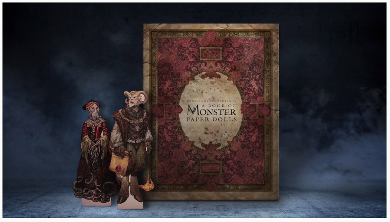
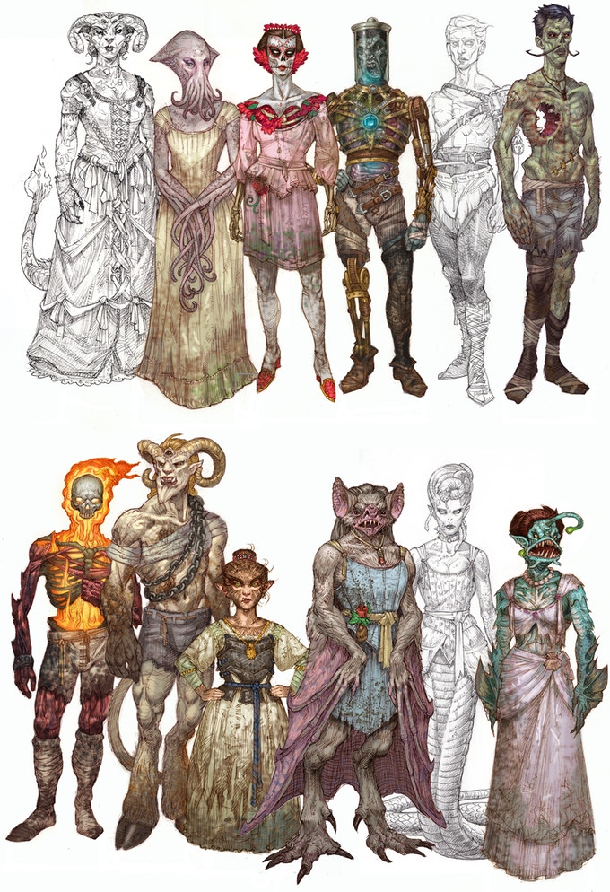
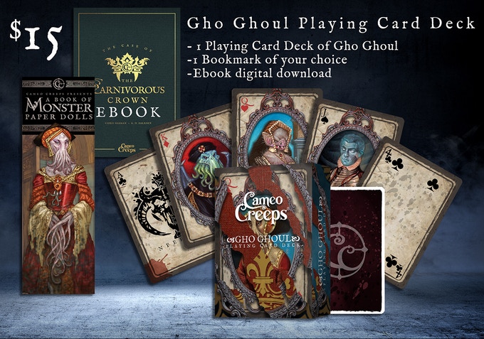
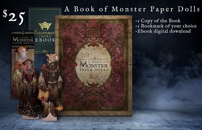
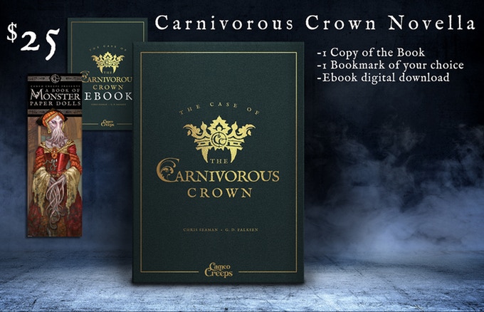
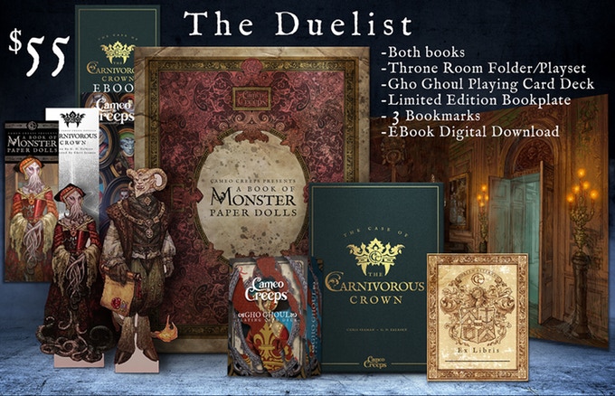
A Book of Monster Paper Dolls by Chris Seaman of Cameo Creeps. So much more than paper dolls. Literally; there is an illustrated novel and playing cards too.
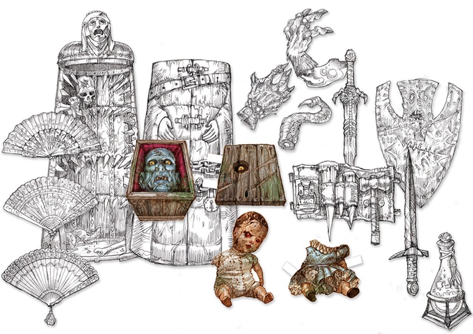
It has great monsters. Sidebar: all things shown in pencil are wip (works-in-progress), these lovelies will be full color in the final version.
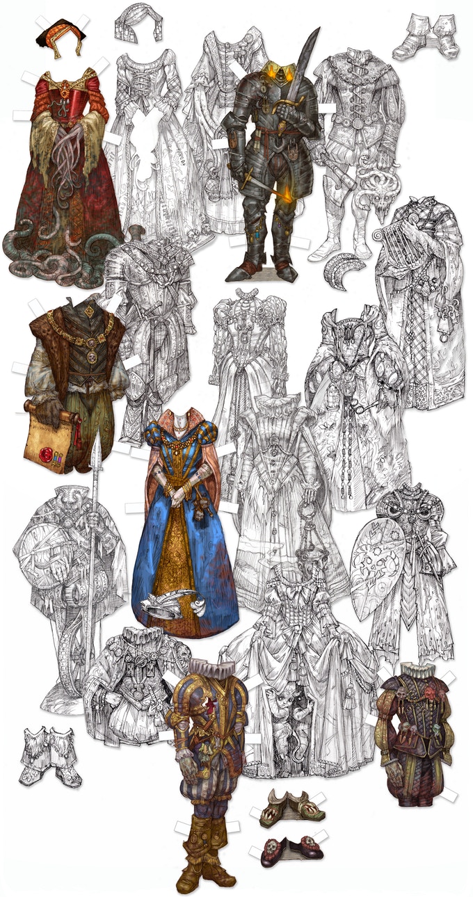
Those marvelous monsters have equally marvelous costumes.
And ghoulish accessories.
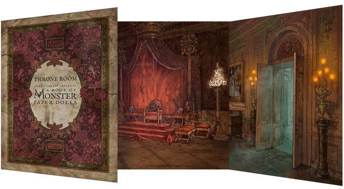
And an add-on Throne Room set.
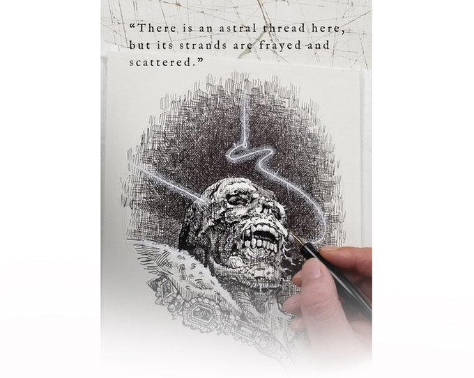
There is a creep-tastic novel with pen and ink illustrations.
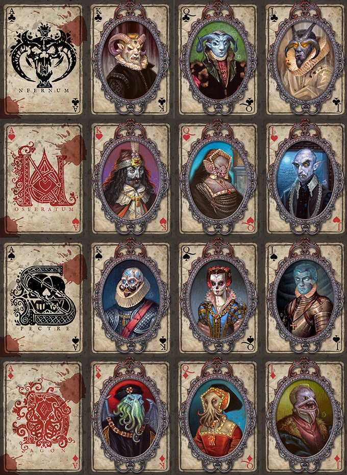
Finally, there is a monstrous set of playing cards.
There is a Serious amount of Creepy going on here. I’ve already pledged. Well, actually I’ve already pledged and then raised my pledge. Greedy little me, had to have more than just the paper dolls. Also doing my bit to try to get it to survival level of moneys (not just greedy).
Here are a few of the pledge levels:
So go have a look and then pledge or don’t. Please spread the word on social media either way. This puppy only has a week to go and it is currently at 70% funded. There are those of us who need our gruesome fix, we need it bad! Please help.
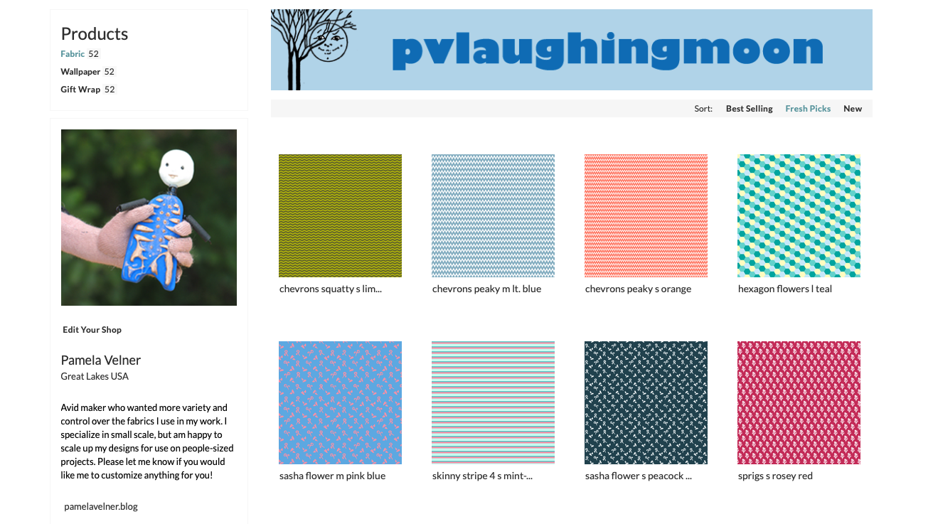
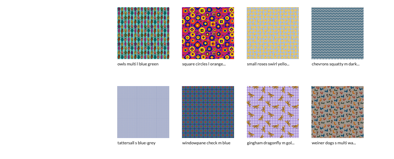
All these designs are still exist. If you want one that isn’t currently in my shop just message me and I’ll reload it. Spoonflower did a massive purge of what is viewable when you are looking at designs, but the designs aren’t gone just not presently viewable.
If you want something rescaled or recolored — message me. This will take longer as I have switched software packages and am currently in the morass of converting designs to the new software.
Sorry, I was gone FOREVER, wasn’t I?
I’ve been very busy with Lots of things. Which I will show you in coming posts.
But first . . . an Announcement:
The Spoonflower shop is OPEN.
And just in time for their 50% off fat quarters sale. Which ends August 11th.
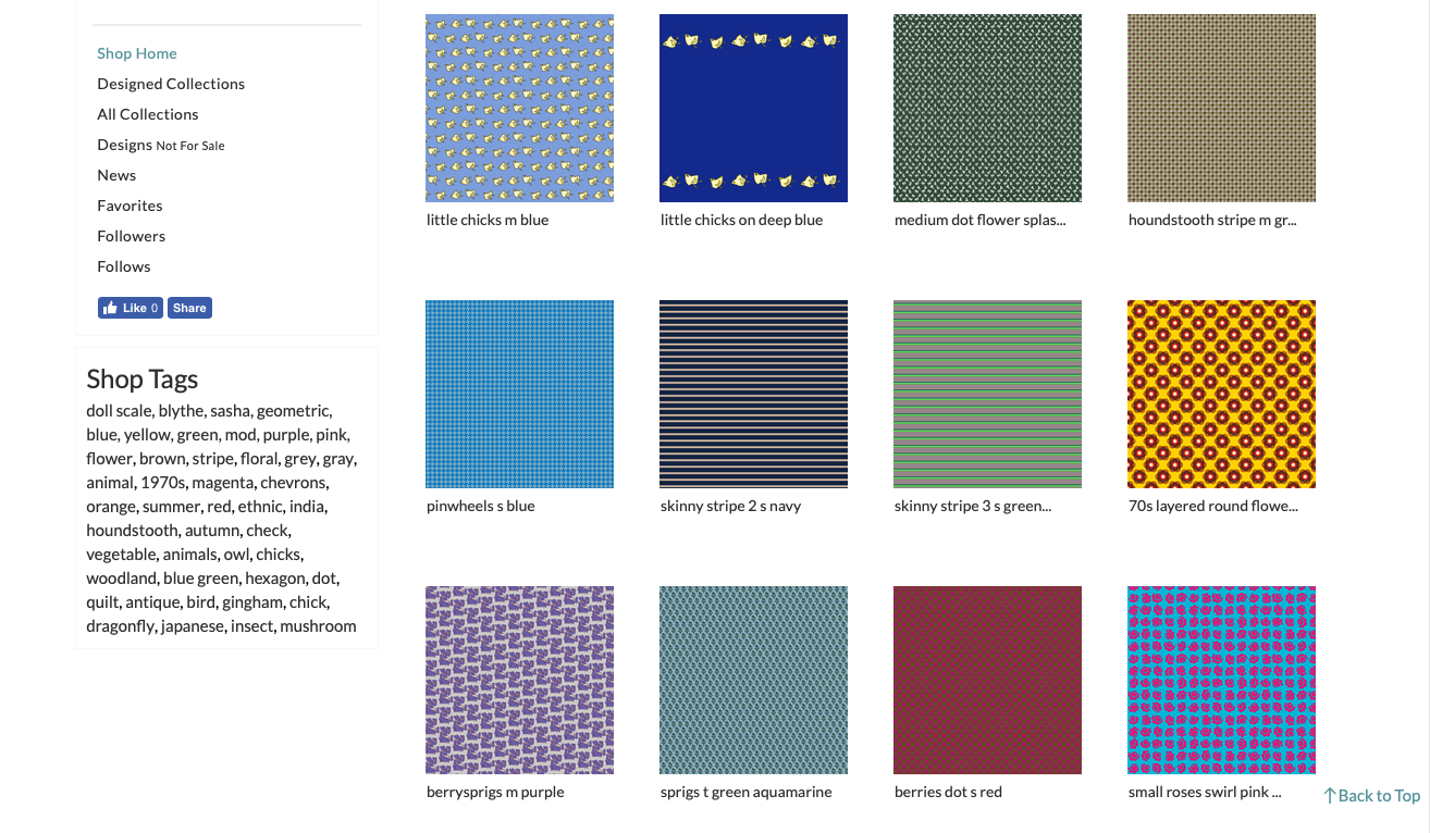
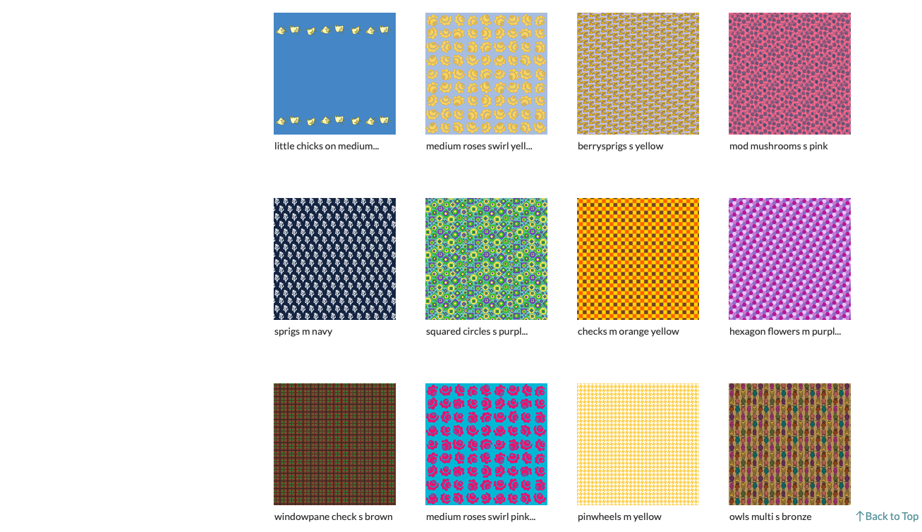
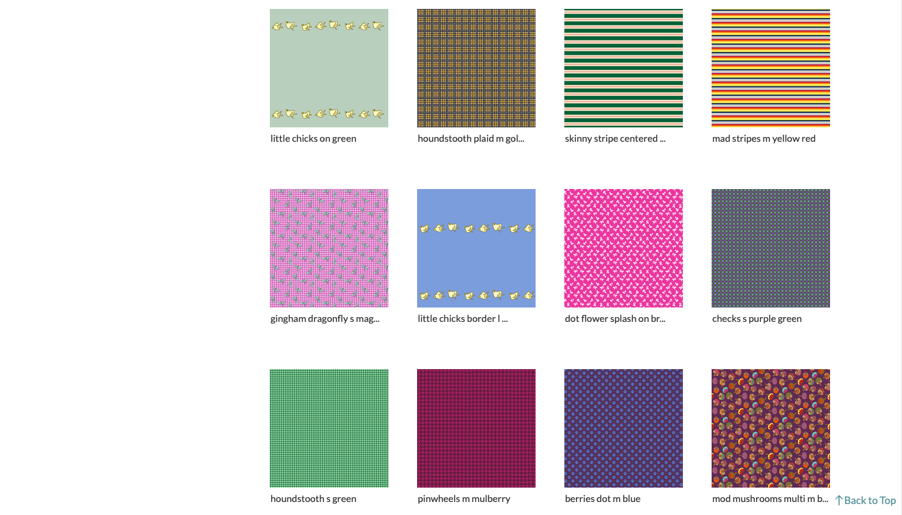
I’m concentrating on doll scale fabrics. All the designs are labeled as S (small 8″ to 10″ dolls) M (medium 12″ to 14″ dolls like Blythe) or L (large 16″ to 18″ like Sasha or American Girls). There are a very few labeled T (for tinies like RealPuki or Kiddles). So if you want some small scale fabrics and like what you see above — go shop!
I will be adding new designs and color schemes periodically. Enjoy!
So this is a really great short documentary. No jive!
Take 15 minutes and go watch it now. Go Now! The link may only work this week; it’s the Documentary of the Week at Shortoftheweek. If you’re at all like me you’ll feel a bit sad, but also all gooshy and warm inside afterwards.
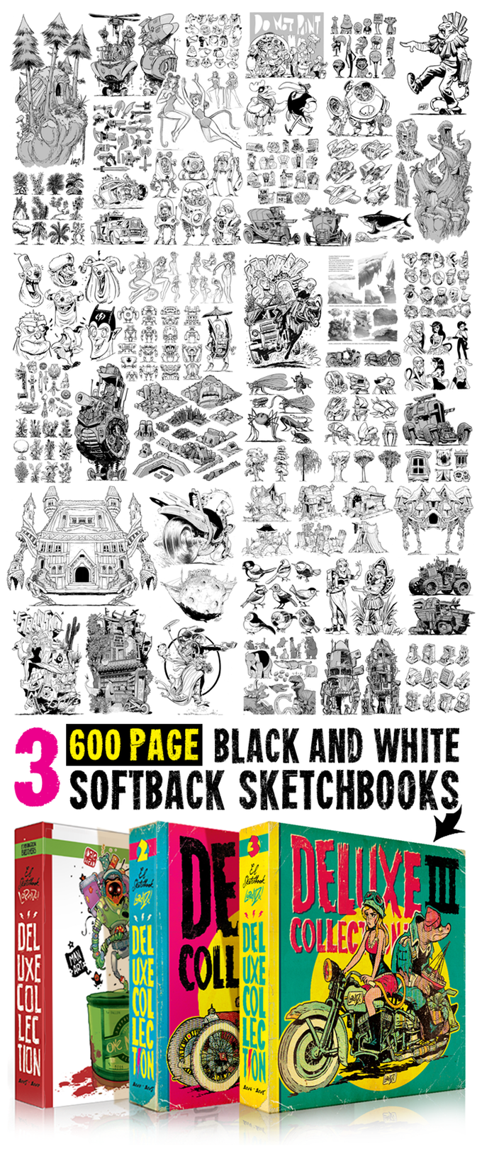
I posted about the first book in this series last year. I supported the Kickstarter, got my awesome book and was Very Happy.
So when I got my email saying book 2 is live, I immediately went and pledged the project. Here’s an overview:
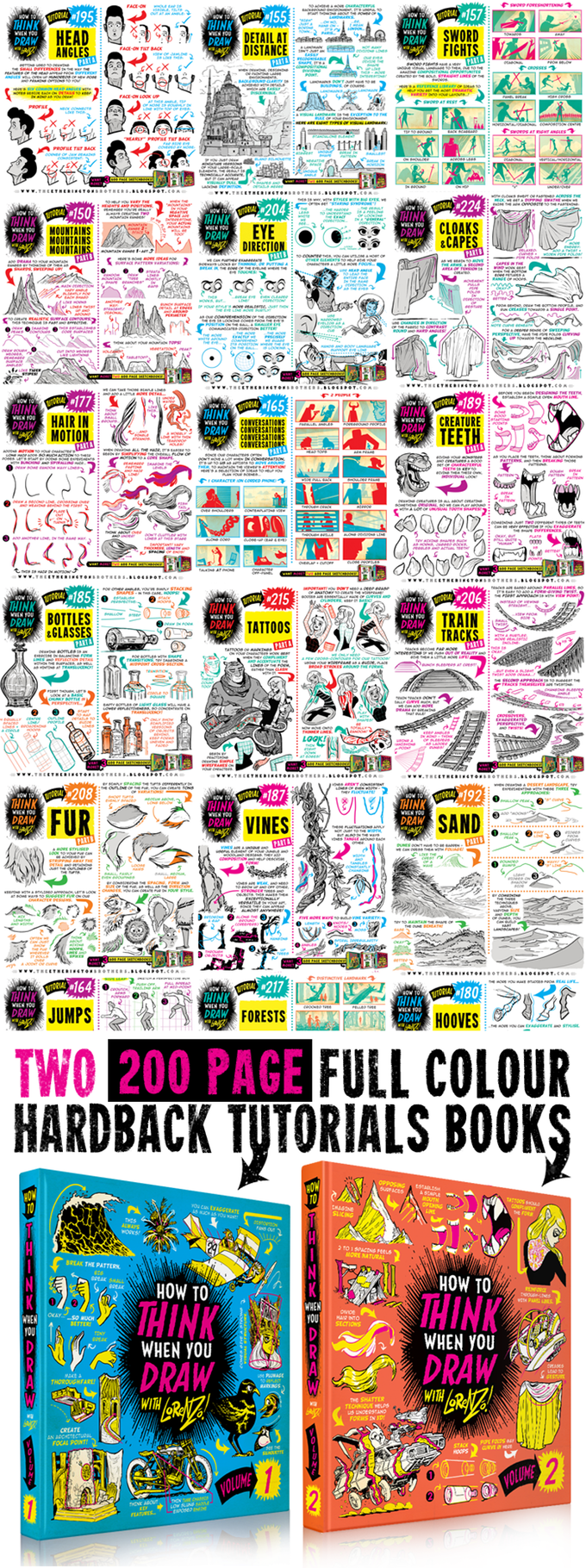
and an overview of the massive sketchbooks, each weighing in at 600 pages. Wow!
These are really wonderful books and I’m extremely happy about them. Please let everybody you know that these are out there. The Kickstarter is already lighting up like a bonfire — Really Very Completely Funded and it’s only been live one day.
Take the hint people, these are books you want to own!
This time around I’ve chosen this pledge:
Shipping to the U.S. is a bit steep but remember that the Sketchbooks are HEAVY! 600 pages of paper does add up.
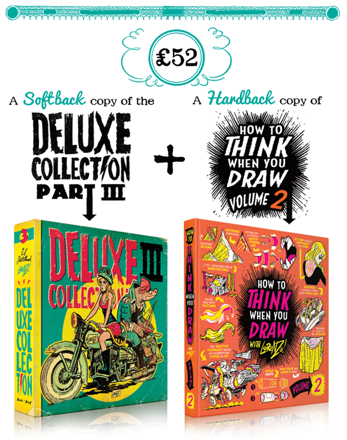
So please consider pledging yourself to this project. You can learn more about the artist at his blog.
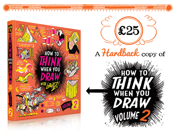
And YES, I know that all the How to Think When You Draw content is there on the blog for free; this guy is giving us a lot, really a whole lot . . . buy the book anyway. Having a hard copy in bound form is BLISS!
If you for some strange reason didn’t get book 1 last year. You have a second chance! There are several choices of pledge that include both book 1 &2.
This post is for everyone who needs of bit of cheer on what is a pretty lousy day.
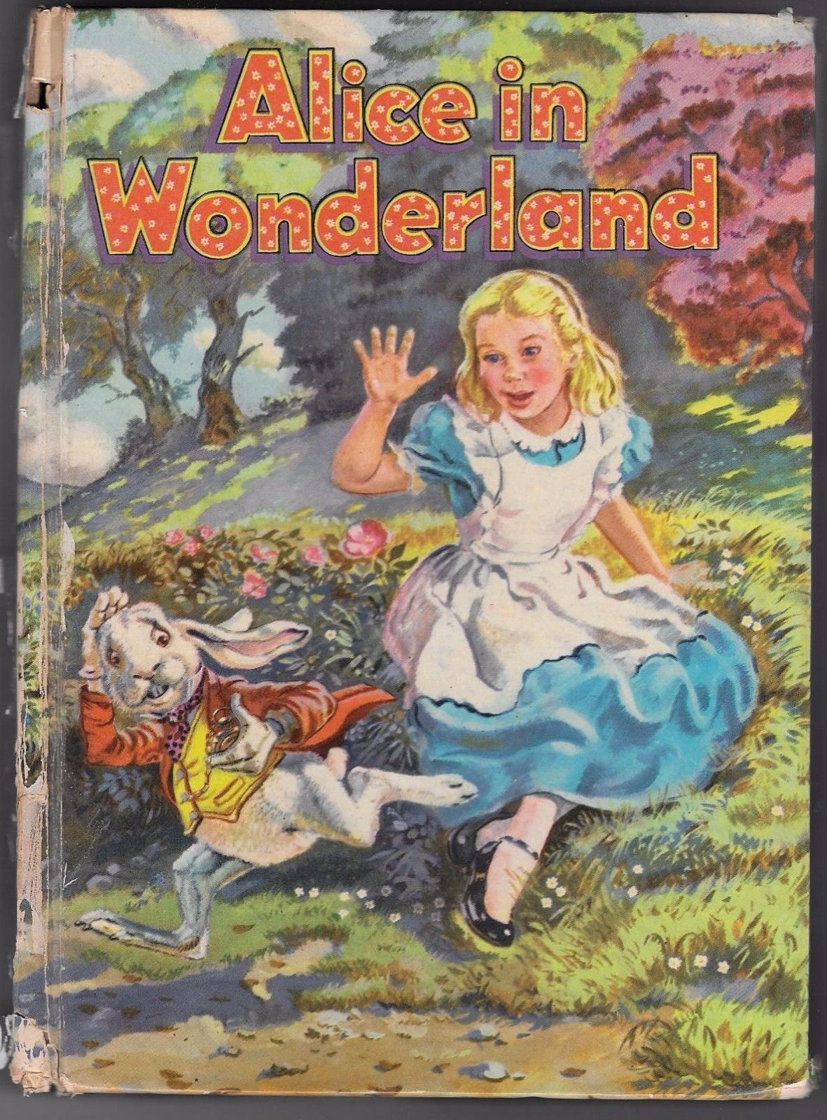
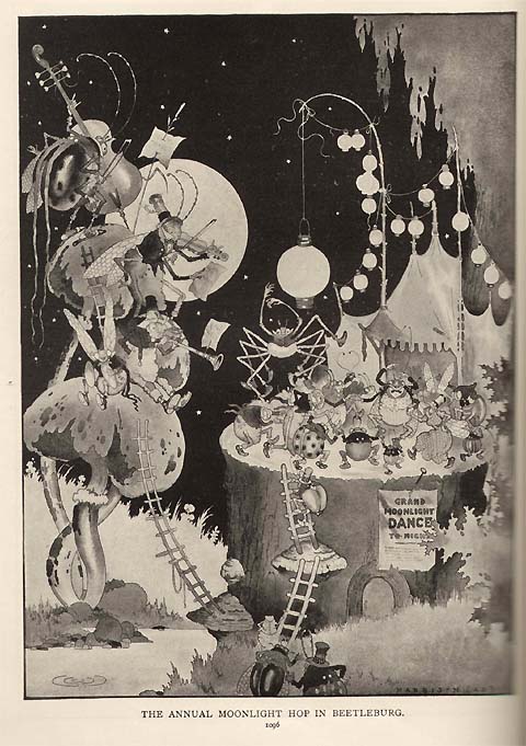
Right now I feel quite a bit like the white rabbit in this picture. Time just seems to be getting away from me. I can’t seem to catch up.
J’s health situation is finally resolved, with him being mostly his old self. But I’ve lost so much time and momentum over the last year that I’m feeling a bit overwhelmed.
Sorry to have so shamefully neglected my blog for so very long. I have managed to build up a huge amount of photo/links in pinterest for lots of interesting things. Hope you have been enjoying that in my absence.
So here’s to better times ahead.
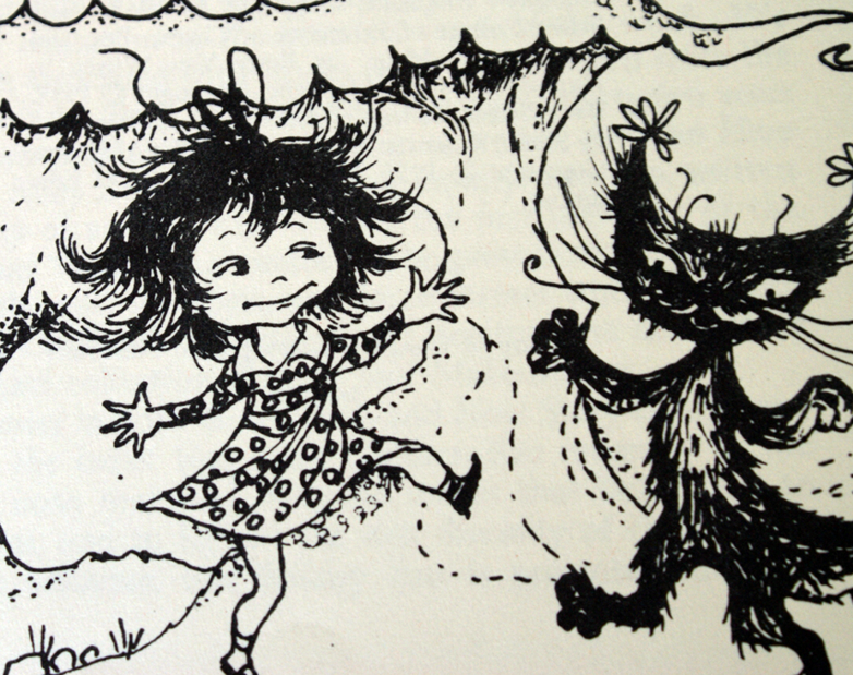
Let’s all do a little cat dance.
Or perhaps attend a Grand Moonlight Bug Dance. Let’s all think lovely thoughts.
Crazy times, that’s where I’ve been. Crazy Not Good times. J got really sick in mid-January. REALLY Sick. Like emergency surgery and then repeated surgeries All Year sick. So it’s been an incredibly stressful year. Fortunately this last procedure seems to have worked and we are doing our best to adjust.
So sorry to go missing with no explanation or anything. But I wasn’t ready to share this until now. Now, as in meaning with him being mostly better, I can talk about it.
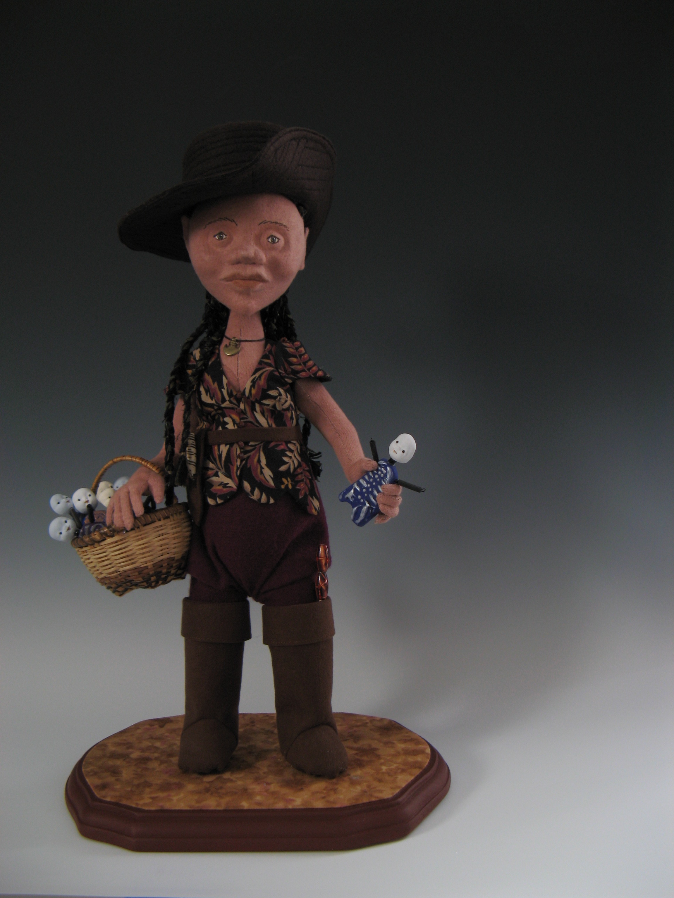
So despite the horrible year I did manage to do a few things. Last holiday season (before the ugliness began) I managed to update one of my old Fae dolls (remember this).
I was wrong, she was never a gentle soul and she was never happy about how she looked. So I gave in and gave her what she wanted.
Now she’s a Pirate and we are both Much Happier. I know, I know; the photo is crap. Better ones will come. She is now a spy in the marketplace, collecting information from local informants and scoping out the various merchants.
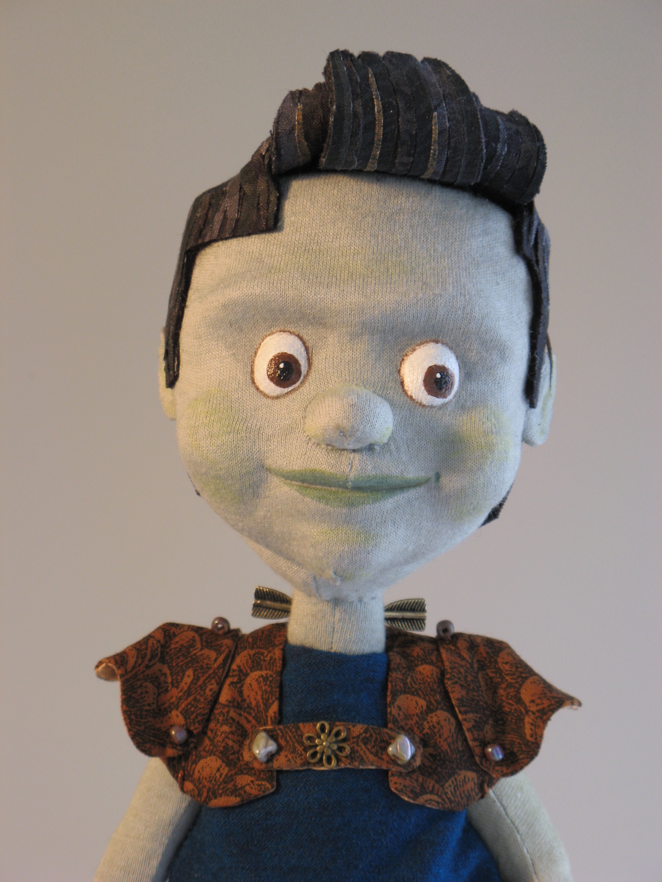
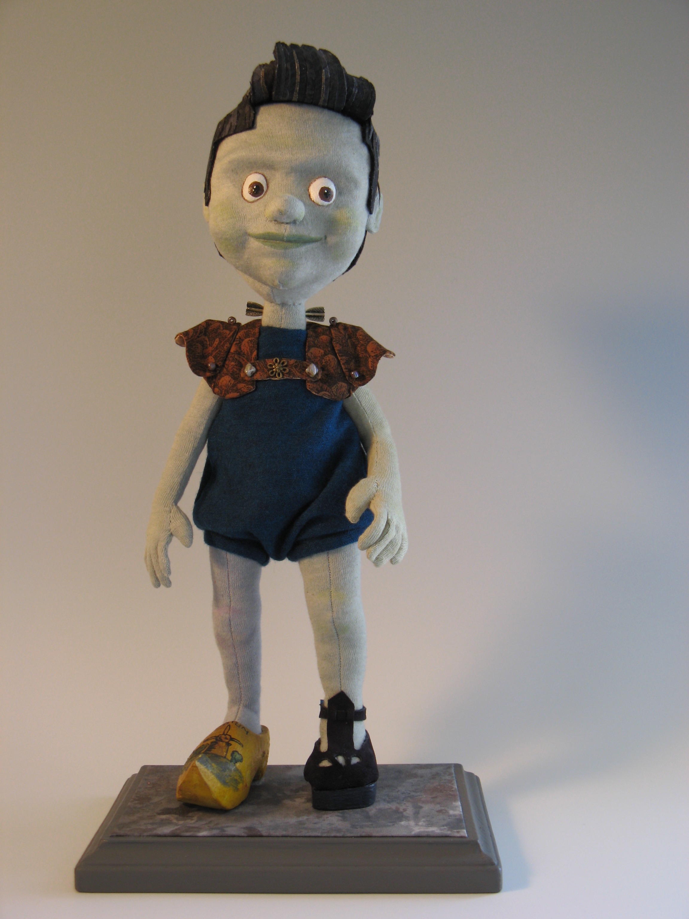
Here is the brand new piece I made very early this year:
Pinoc-enstein! Made for the Stampington Art Doll Quarterly Autumn 2018 issue he is a mash-up of a fairy-tale and a classic horror story. He made the cut and was published in the magazine.
Yes, he does look a bit like Bruce Campbell, who I adore. And No, it was not intentional, I didn’t notice the resemblance until he was 90% done and I was doing the costume. Shades of Bubba Hotep!
Other notes: tuning peg electrodes for a quick energy boost, unequal size eyes ala the Scarecrow from Oz, Wooden shoe on the leg he ripped off a Dutch puppet, large left arm ripped off a different puppet, a built-up shoe so he can walk mostly evenly, and fabulous wood curl pompadour bangs. He has one of my jackets but I made it a sort of Lederhosen-Bolero. I had a Great Deal of fun with this one!
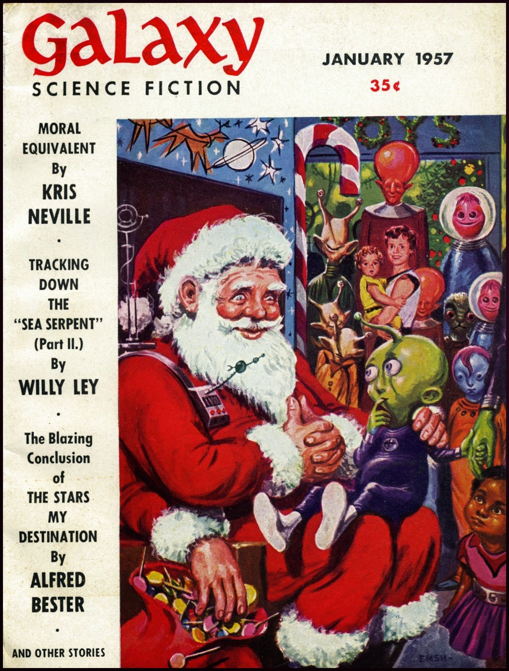
Lastly, a Little Good-Hearted Alien Holiday Cheer!
Even little green kiddies aren’t so sure about Santa. Good thing Daddy is there to hold his hand.
So, Ho-Ho-Ho and the very best Holidays to everyone. Happy-Happy!
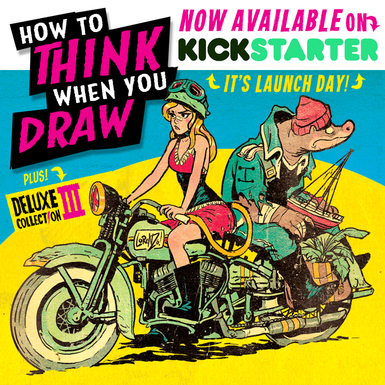
Which the author politely asked me (and everybody else who backed it) to repost/blog about on social media. I like his style, so I am. I first saw his stuff on Pinterest where people had pinned lots of his drawing tutorials. Very nice, short, to-the-point, purposeful and well thought out one or two panel tutorials.
Then I found out he was making them into a book. Which I promptly got on the email list for. He sent me an email before the launch day asking me to spread the word. Which I am finally doing. Sorry Lorenzo, I was trying to beat a deadline and couldn’t get to this until now. Hey, there are still 20 days left, I’m not that late.
Go to his blog, his deviant art page, and the Kickstarter to find out more. Lorenzo has done multiple book projects; both the regular publisher route and the Kickstarter route, and the book layout is all done and ready to go to the printer. So this is a Kickstarter I feel confident will go off without a hitch. Looking forward to receiving the book in my own little hands, and until then I can placate myself by doodling along to the deviant art/blog stuff.
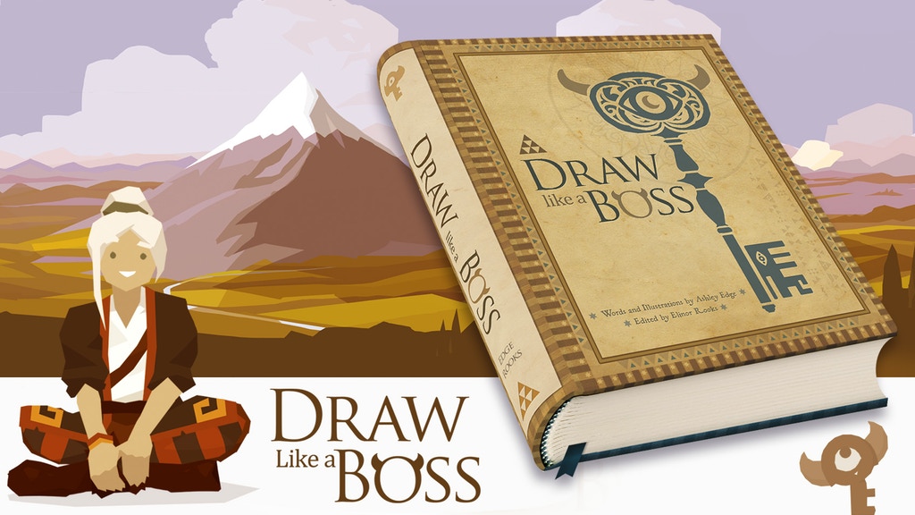
After I backed How to Think When You Draw, Kickstarter recommended this other drawing book to me: Draw like a Boss . Which I hadn’t previously heard of. So I looked at it and realized that I really liked that book too, soooo I backed it. I like the idea that they gave it a sort of role playing game system to make it less intimidating and more fun to learn to draw.
This is the “final printing Kickstarter” so I guess a lot of other people liked the game format idea coupled with some pretty heavy duty classic masterworks art techniques. Since they’ve already had multiple printings of this title due to heavy demand, this project should go smoothly as well. I chose the sewn hardcover version for durability.
So go to the link, maybe you’ll like it too. Back the projects, don’t back the projects; it’s up to you. I just know that I’m glad when people let me know about interesting things so I like to do the same.
Oh, Last Word: Don’t go getting all spoiled just because I posted twice this week. If there weren’t time-sensitive things happening you would not have gotten Any posts this week. Remember I was trying to meet a deadline. Which I did. So There!
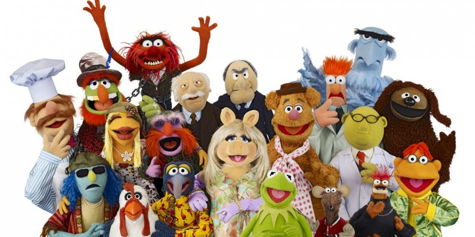
If you’ve been reading this blog for a while you already know I love the Muppets. I mean, really truly, totally, unconditionally, to-the-moon-and-back, saved my life literally, LOVE the Muppets.
So today J found this interview on Splitsider and immediately came and got me and made me watch the clip and read the interview.
OMG (all of them — Allah to Zeus) there is a new documentary where five of the original muppet performers sit down and talk about the experience of being a Muppet. It’s sort of like Dinner for Five without the dinner but all about Muppets.
Is it just me or is this so totally exciting that you just have to go Squeee! and dance around a bit?
The documentary goes live tomorrow March 16th at MuppetGuysTalking.com. You can only see it at that site; it is Not Coming to a Theater Near You! You can mark your calendars if you want but since it’s only one day I think you can just remember.
I just got an email from the website saying thank you and giving me some details. It goes live at 6 am Eastern USA time, (10 a.m. in London, 12:00 noon in Cairo, 9 p.m. in Sydney, and VERY early — at 3 a.m. if you’re on U.S. Pacific Time). I don’t know what this is going to cost but there will be two options: 1) the film, 2) the film plus some “really great extras and bonus items” which is called Below Stage Pass, get it, below stage — where the puppeteers are. You can probably guess which one I want.
Hooray!
UPDATE: Film is now live; I went with option 1) film only. Which cost me a whole $9.97, I downloaded it to my computer so even if my internet goes down or is slow I can still watch it. FYI I couldn’t afford option 2 and besides I’m still not even on Facebook and my monitor doesn’t have a camera and I don’t need to be part of a live online audience. Oh well.
I am perfectly aware that I’ve been gone far, far too long. Life has been exceedingly crazy here for way too many months. Not crazy in a good way, not in a horrible way, just crazy with things like the flu and other icky health stuff and boring life stuff that takes up too much bloody time.
Things are slowly improving and in the last week or so I’ve been working on a new piece of art. Yes, working on it finally because the deadline is looming and it needs to get done no matter how tired I am.
So here is a link to a really wonderful music video by a Dutch band called Death Van that I saw on the Dangerous Minds blog. Reading their post I do agree that it reminds me of the Brothers Quay’s work, but it also reminds me of sequences in the movie MirrorMask. Very cool, very surreal, very low-brow art, totally love it! So click and watch, several times maybe even.