I’m reading this wonderful, non-fiction book for beginning writers. I mean really, really wonderful. It is going to help so many people who rather desperately need that help in writing their novels.
However.
Yah, you knew that was coming.
No, I’m am not going to talk about using “Wedding Invitation” fonts or any of the other horrible errors in judgement that some people make that cause their book scream “I have NO IDEA what I am Doing!”
This is not at all that sort of issue. This book is a very nearly PERFECT book.
BUT there is an issue, a big knee-capping issue. It is in the compositing of the pages.
Fact: I used to be a professional proofreader, back in the days when publishers and book manufacturers had composition departments. Every publisher, university, technical book company had what was called “style” standards or even a “signature style”. As in; you could pick up an academic book in a book store and know immediately if it was published by University of California. Just by the font choice and page style.
There are/were books published that delineated these styles. I still have a copy of The Chicago Manual of Style on my own personal bookshelf.
So back to the book. I’m steaming along, loving the way it is written. The voice . . . I’m just loving the voice. It’s like I’m having a conversation with a friend over coffee. A lovely, brutally honest friend who is telling the reality of how to do what I’m thinking about trying to do.
And I hit it. A headline all by itself at the bottom of a page. Its related content all alone at the top of the next page, screaming like an abandoned baby in a stroller that is plummeting down a flight of steps.
I think, this is a mistake – this somehow just got overlooked. She is too good a writer for this to have happened. She would never let that baby text go screaming to its doom in rush hour traffic.
And then it happened again . . . and again, and again. Now I’m screaming inside my head – HOW?
Suddenly it hits me. This is one of those “everyone knows” errors.
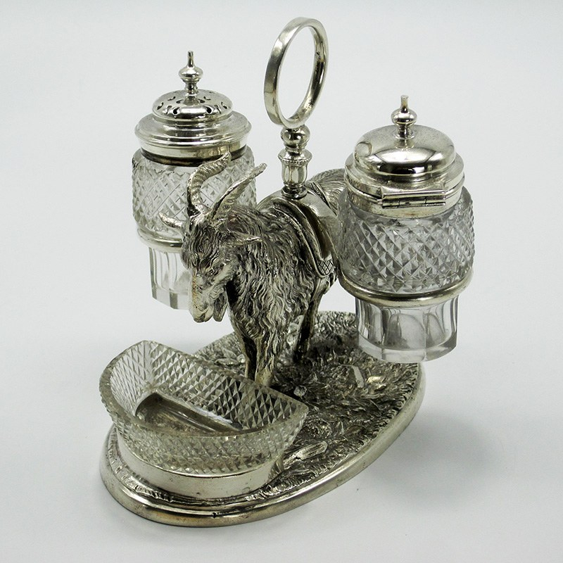
This is Victorian three piece salt and pepper service. Salt, Pepper and what?. No One Knows! These things were so ubiquitous that Everyone Knew what the little bowl was for (mustard, relish?), so matter of fact that NO ONE ever wrote down what that third piece was meant to hold!
So now we still have a bunch of these things floating around the houses of those who love antiques but no one knows what is the proper thing to put in the little bowl.
So Why Don’t Any of the Style Books Say “No Headlines at the End of a Page?”
Because Everyone Knew. Everyone knew that leaving a headline or even subhead alone at the end of a page was such a heinously unacceptable thing that no one would allow it.
Back in the day plenty of the contracts/style pages that came in with books would say things like “no widows, no orphans” or “no orphans”. A widow is the first line of a paragraph left alone at the end of a page; even if it was only preceded by another text paragraph. An orphan was the last line of a paragraph falling as the first line of a new page.
I don’t think a contract ever said: “A headline or subhead near the bottom of a page must be followed by at least two lines of text”. Because it was understood that this was the way things were done.
We all knew that to do otherwise was to totally and absolutely disrupt the flow of the writing. Like hitting a tall brick wall painted with Radioactive Zombies Ahead signs: Halt All Progress. Not to mention leaving all the baby text falling down that next page hill with no one to save it.
I can live with widows. Orphans still make me cringe but publishers are increasing finding them acceptable. But there isn’t even a term for leaving a headline alone at the bottom of the page. I guess we should make one up. Maybe we should call it the “no radioactive zombies” clause of your books style.
So if you are self publishing please keep your book free of this Roadblock error. If you’ve hired a book compositor and they are young-ish; please pass this information along.
