First off; Milton Glaser is adorable. Really cuddley, love to have dinner with adorable. For those of you unfamiliar, Milton Glaser is a (absolutely famous) graphic designer. There are those who say he’s The Essential American Graphic Designer. He’s just plain brilliant. Do a Google image search — go ahead, I’ll wait. . . See what I mean? But here’s the real deal: everything he does, he does thoughtfully. He doesn’t just “phone it in”, he thinks hard about what he wants to happen as a result of the imagery he designs, and he purposefully chooses to make designs that will affect a positive change.
Wha?? Yes, that’s right Virginia — simplicity done right is really, really bloody difficult.
The other day, I was in the puddle-dom zone so I turned on the TV and wow! Sundance channel was showing Milton Glaser: To Inform and Delight. So I watched it. And loved it. Now lest you, dear reader, think I’m new to the Glaser fan club; when I went to graphic arts school (an undisclosed number of decades ago) Glaser was mandatory subject material. Then in the 90’s I saw a show about him and some book project he was working on (massive brain food fix), and now this new (made last year) documentary comes along. Happy, happy little brain cells are dancing in my head, they’re having a party and I do believe that there is even cake and ice cream.
Now by this time, you are probably saying to yourself “OK, so she adores Milton Glaser, but what the heck is a Chatterling and what’s it got to do with graphic design????”.
Here’s what: Words have Power. Images likewise. Knowledge of what words mean and how to use them correctly has massive power over the ability to communicate. Which brings me to the Chatterlings.

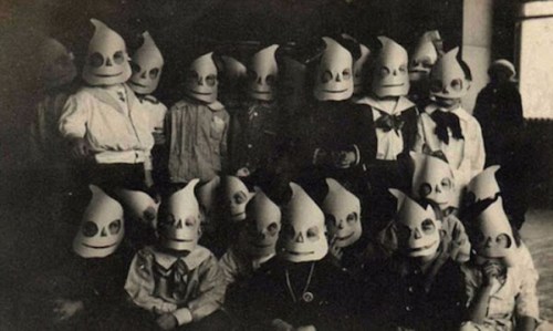
The Chatterlings in Wordland, by Michael Lipman is a fascinating and delightful vocabulary/grammar textbook (disguised as a storybook) from the early twentieth-century. It teaches the necessity of using the most precise word possible in order to communicate what you really mean. Yes, instead of making people guess (“well, you know what I meant”), actually just saying what you mean in the first place. Wow, what a novel idea! Which requires that you learn the sometimes not so subtle difference between the meaning of different words — oh drats; that’s vocabulary — arrggh! Well, this beautiful little book does it in an entertaining, indeed enjoyable, way. Here’s the beginning of the story:

See what I mean, it’s a fun story. Oh, and a spade is a shovel with a flat, rectangular blade (not pointy). It falls into the category of all poodles are dogs, but not all dogs are poodles. It’s all about precision.
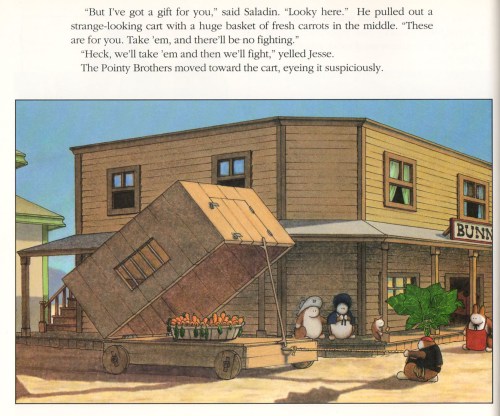
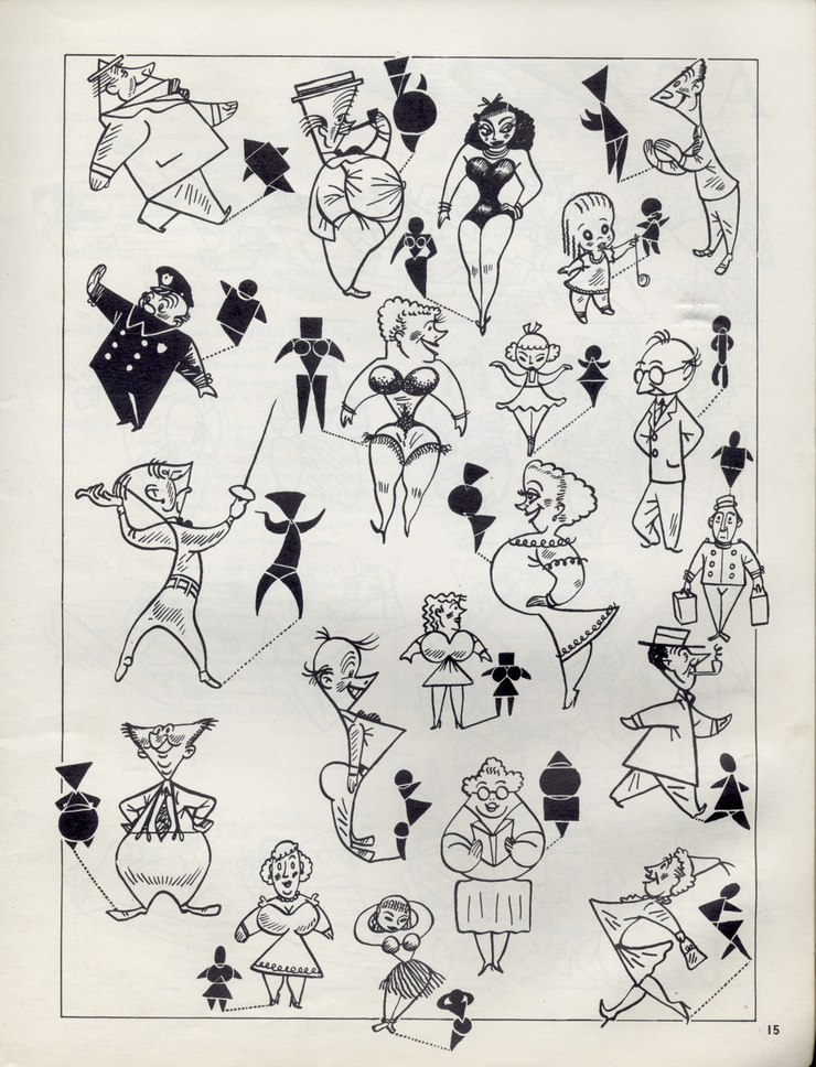
The illustrations are great, I just love the way they help to demonstrate the distinction between words that mean similar but not identical things (which is really the entire plotline of the story).


Here’s another example:


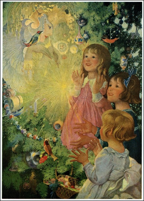
Which by the way clarifies why “Tell the Captain I am disinclined to acquiesce to his request” is such a great line. Yeah, I’m a Pirate, no surprise there.
Even the Suggested Helps section at the end is full of great stuff. Suggested Helps, what a wonderful name for what would now be a Study Guide or Teachers Guide section (how drab and off-putting). Suggested implies that a child could and perhaps should read the pages and maybe even take something away from the experience.

The world admires the man or woman who writes and speaks English correctly. Oh, how I wish that this were still widely true in America. Somewhere along the way, we lost sight of the fact that learning can be both fun and functional. That the big picture most definitely depends on the tiny details being accurate. I very much wish that someone, somewhere would bring this very useful book back into print. There are a great many children (and no small number of adults) who could greatly benefit from reading it.
Because after all, there is great power in words and their attendant images.
Read Full Post »